Are you interested in improving your hand-lettering skills? Alright, let’s head right to the beginning. It might seem simple to draw a letter A, but As are actually pretty difficult to figure out when you're drawing them, especially if you’re new to lettering. So keep reading to find out some tips and tricks for perfecting the first letter of the alphabet.
First of all, forget what you know about the letter A. Let's look at it like a shape, not a letter you've seen since you were a wee one. A capital letter "A" has three elements: the left stem, the right stem, and the crossbar. The two stems meet at the top forming a triangular angle that is symmetrical, and the crossbar spans them horizontally in inside, forming a triangle in the middle top.

The capital letter A and its parts: The stems (left and right), the crossbar connecting the stems, and the top apex how the stems meet.
But how do we draw this? Let’s look at a reference to make sure we form it properly instead of leaning on our prior knowledge. What if you had never seen a letter A, how would you draw it? It's best to use an existing font, like those on your computer, and observe its parts to really see how a letter A is formed. This may seem like something you should know, but there are nuances you might have never thought about.
Which side is thicker and thinner?
Is the top pointed or squared off?
Where do I put that cross bar?
Looking at a real font on your computer will help you look at the letter proportions and how it is put together and see the shapes that make up the form. So go ahead: go into Word or another program, type up some capital letter As, choose a few different fonts from your computer, and make them large so you can see them clearly.
What do you notice about the various fonts? How are they different? Which do you like best? Choose one to use as a basis for your drawn letter A.

Use a real font reference from your computer or Google to observe a letter A and how it is formed rather than your own memory.
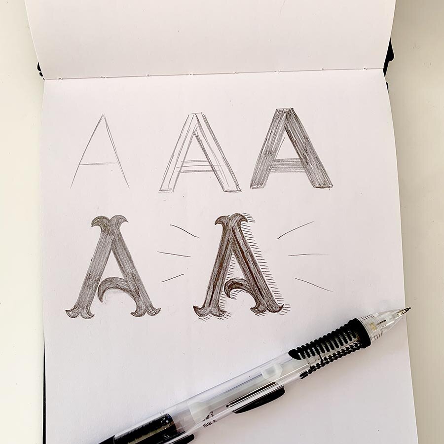
Once you've chosen a font to reference and studied the proportions and form to figure out how it's shaped, you can start drawing your own. You can start with a skeleton, just a light single stroke representation of the letter. Even if you plan on having a bold letter, it's best to start with a skeleton to make sure you've formed your letter correct. Then you can start adding weight lightly, filling it in to compare the thickness to the example. It's not recommended to start with an outline only because it's so hard to see the shapes when it's not filled in.
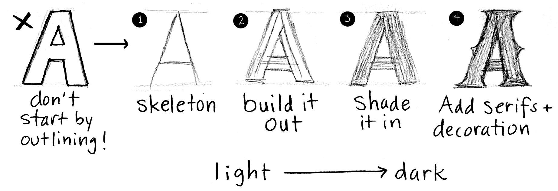
The steps for how to draw a letter. Starting with the outline is hard to make sure you’re using the proper proportions, so instead start with a skeleton, then build out any weight, shade it in so you can see the full form and check your thicknesses, and then finally fine tune and add any serifs and decoration. Voila!
Starting lightly and adding more pressure to darken your lines as you go will allow for easier erasing and self-correcting. Drawing letters is about drawing and redrawing, erasing and drawing again until it looks right.
After your shape is pretty well drawn and checked the shape and proportions, you can keep adding to it. Add serifs (those little tweaks at the bottom of the stems on some letters) if your font has them. Then you can think about adding some pattern or decoration inside the letter, or shadows outside the letter.
As you draw, avoid the common pitfalls for the capital letter A:
Putting the crossbar too high or low. Putting the crossbar too high means the triangle inside the top of the A is small, which makes the letter hard to read. Too low and it's large with not much below it, so the letter is also hard to read. The crossbar can be flexible a bit on placement, but aim lower rather than higher. It won't be at the exact middle, but most likely a little lower, and will need to be even lower for bolder thicker letters than for thinner delicate letters.
Make sure your letter angle is symmetrical! While some italic fonts may not be symmetrical, most regular fonts will be for the letter A. Imagine a piece of pizza, it’s pretty much a perfect triangle with the two longer sides the same and the point in the middle. Make the angles of the R and L stems the same for capital As until you are comfortable with moving to more difficult and italic letterforms.
Avoid putting the thick side on the left. This is such an easy mistake to make—you start with the left stem so make it the thicker one. But in a capital letter A when there is a pronounced thicker side, it is ALWAYS on the right. Right = right!

Common mistakes when drawing the letter A—don’t fall victim to these!
While it's great to use a reference to draw a letter from start to completion, that's just copying an existing letter. What about if you want to make it personalized? My advice is to start with the reference to get your proportions down, then put it away and add some adjustments to make that letter your own.
Personalize it! Things you can adjust to make a letter your own (rather than just copying a reference):
Make it bolder (heavier) or more delicate (light) than the reference.
Adjust the width--make it wider or narrower than the reference.
Adjust those thicks and thins--maybe the thicks get way thicker and thins get way thinner, or maybe you adjust so that there's nearly no difference at all.
Add, change, or remove the serifs. This has a signficant effect on bringing that letter away from the original and personalizing it.
Or, use your imagination! What else can you change?

Letter A practice!
To sum up, learning to draw letters takes practice and observation--starting with a real font reference is a great way to begin, but add some of your own adjustments to make the letter a unique piece of art that you've come up with. And keep practicing! With each letter A you draw, you'll see your skills improve!
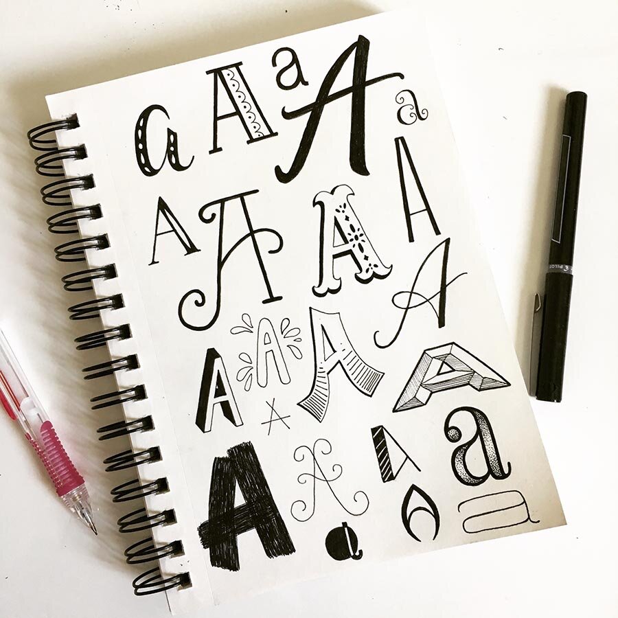
Have fun lettering the letter A in all sorts of styles!
Additional Resources
If you've enjoyed this short tutorial, consider signing up for a longer course in learning hand-lettering. You can follow me on Eventbrite to get notifications when I announce a new online or in-person workshop and grab tickets before they sell out.