Best Food Fest Event Branding Illustration Suite
Best Food Fest branding illustration project, featuring hand-drawn lettering for a custom festival logo illustration, and festival character illustration, for a versatile festival branding suite.
The brief: Create an illustrated branding campaign for a fun food festival using lettering, characters and food illustration across posters, ads, and merch to create a full versatile suite of branding materials that is fun and eye-catching.
Role: Illustrator responsible for concept, brand, design, and implementation of all lettering and illustration.
Tools Used: Procreate app, iPad Pro, Photoshop, Illustrator, Apple pencil.
For “Best Food Fest”, I created a flexible logo and playful, eye-catching poster series to highlight the fun vibes and tasty cuisines to the festival audience. The logo utilized different shapes and lettering styles to speak to the diversity of foods and is flexible to be reshaped and used across multiple touchpoints. A stacked version of the logo became the central portion of four different foods. These were used as stand-alone parts in branded materials, while also becoming the bodies of unique characters. The result is a vibrant series of colorful and flexible on-brand components including a wordmark, stacked food logos, and characters, that are sure to delight festival-goers!
This project was shortlisted for the Communication Arts Illustration Competition in 2026 in the Advertising category! Woohoo!
The final logo blocks for the food festival branding package, featuring hand-drawn lettering with varied styles and shapes to speak to the variety of foods at the festival. Each word is a separate block that can be moved, stacked, and reorganized to suit the advertising need.
The food festival logo illustrations featured on branded cups for the festival branding.

Initial sketches and thumbnails for the logo lettering exploration for the food festival branding, featuring lots of different lettering styles to speak to the varied cuisines of the food festival vendors. Also a few poster design thumbnails to test out layouts and lettering styles for the final poster series.
Once the logo became the central focus, I created sketches testing out lettering styles, color sketches to fine-tune layouts of the logo within stacked food dishes, and four final illustrated logos that could be used interchangeably on posters, ads, merch, and more. The logo word blocks themselves can be separated to be used in different formats outside of the food logo layouts to allow maximum flexibility. Because the logo components were built as building blocks, they can also be reused and repurposed in different festival components, including wrist bands, billboards, lamp flags, cups, stickers, and more. The brand was created to be flexible and allow for the maximum possible uses to be fun, eye-catching, and work for all touchpoints.
After I had a few ideas for using the logo as stacked food, I sketched out some layouts and tried out a color scheme for the food festival branding suite.
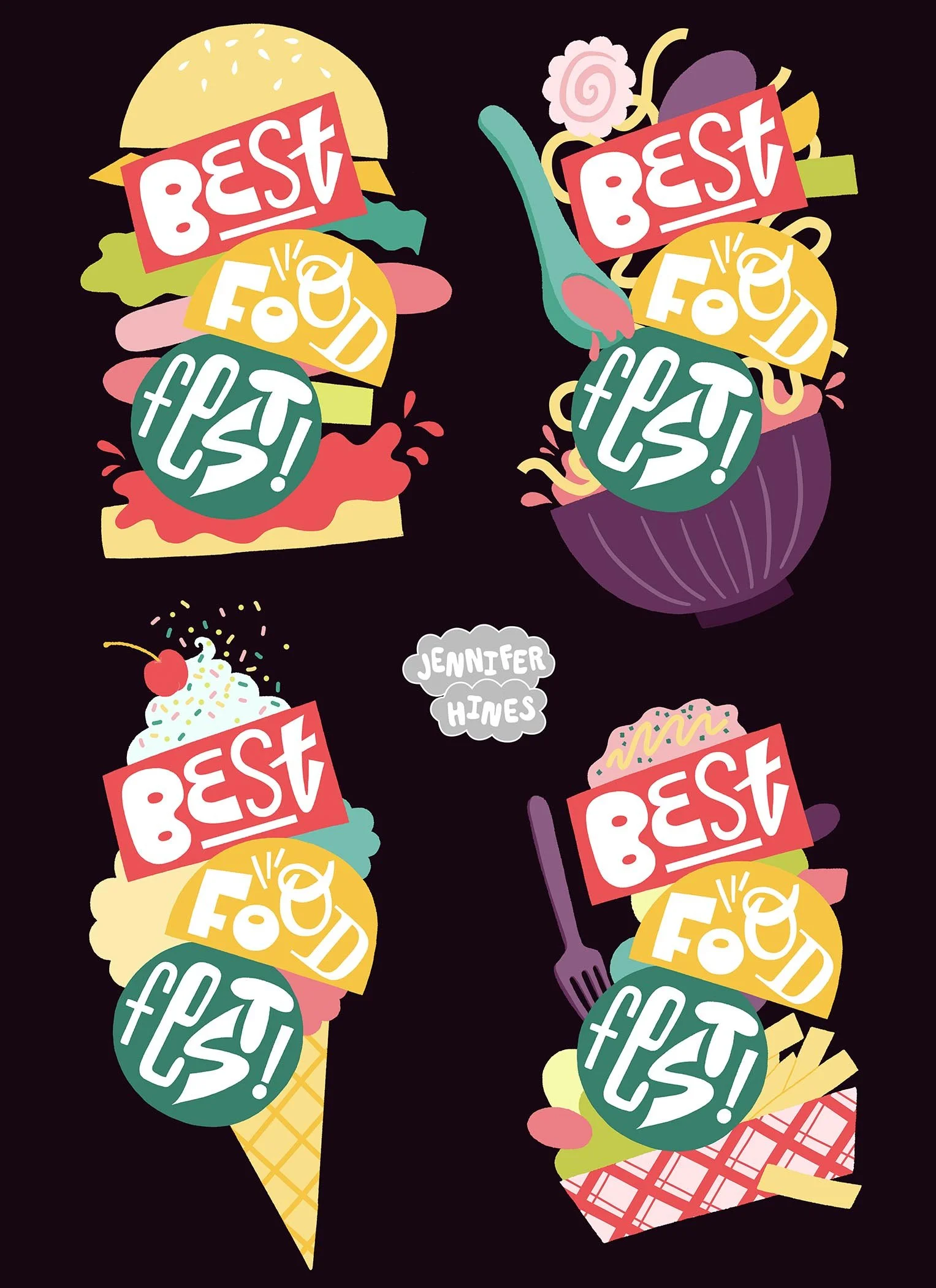
Four final food festival logo illustrations in fun stacked food layouts, showing how flexible the various components can be to bring variety and vibrancy to the food festival branding suite.
The stacked food version of the food festival logo illustration creates a super fun tote bag for some nice illustrated branded merchandise to advertise the food festival!
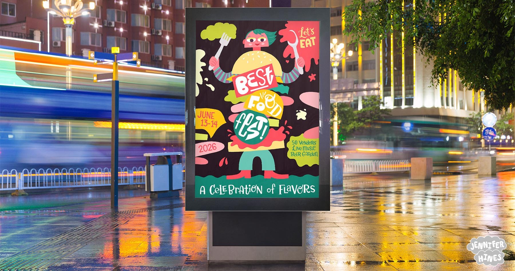
For the poster series, I ended up combining multiple elements with the stacked food logo treatment. I began by sketching some thumbnails of poster ideas on paper, of which my leading idea was a character balancing many foods and the logo in the center. I simplified my sketches until I ended up with the logo as the body of the character. I drew the individual characters to pair with each logo, and the food characters became the central focus for a series of posters to use to advertise the food festival as the centerpiece of the poster designs and some fun related merch.
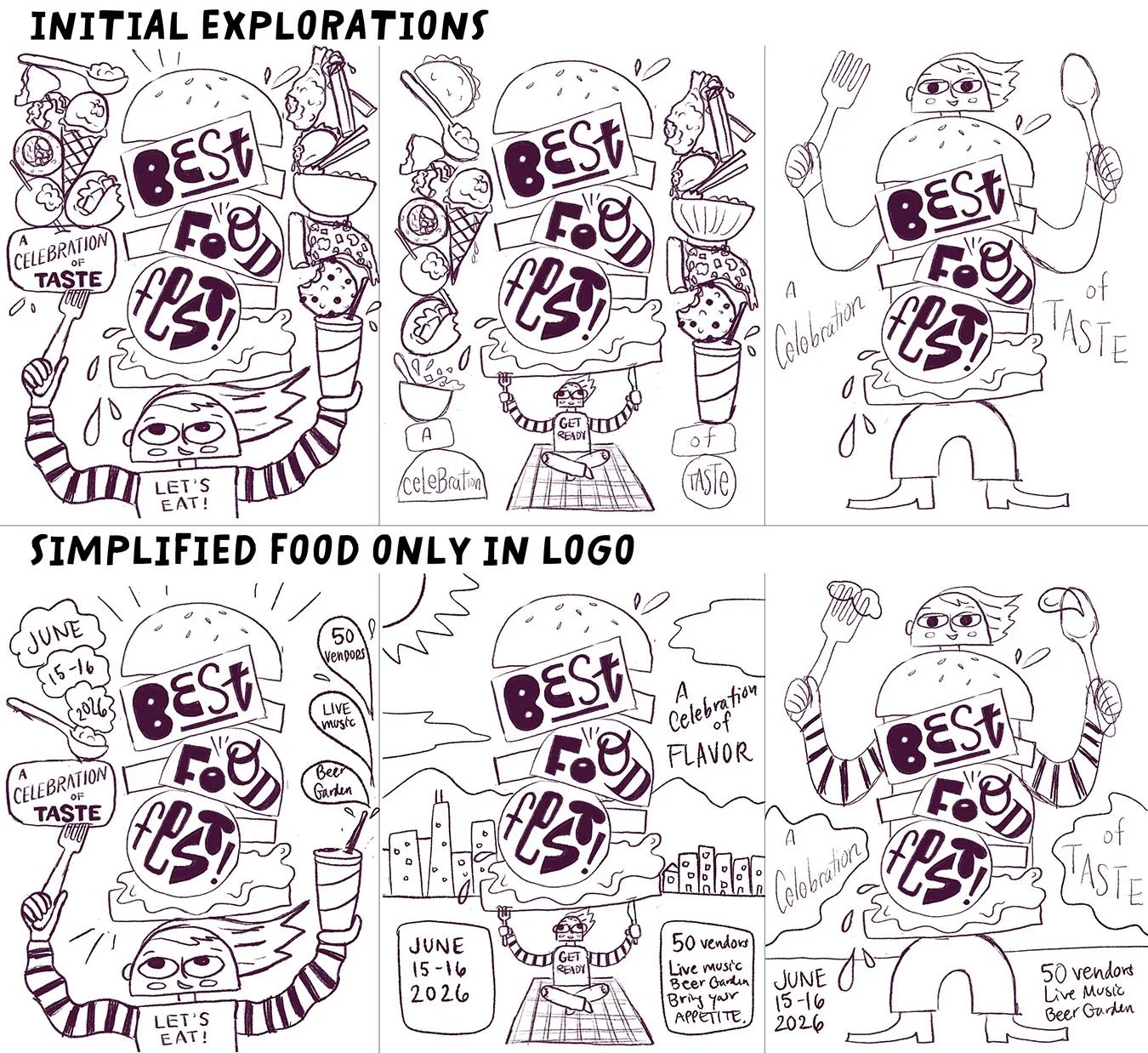
The initial 3 sketches had a lot of foods illustrated and stacked on top of the character, but in the end the simplified sketches with the food only as the stacked logo composition was more fitting and less chaotic, so I pared the complexity down to highlight the fun character and logo instead.

Taking an initial color palette and adjusting the hue and saturation to test out a few varied palettes. I ended up liking my original best, but this exploration led me to adopt a darker background to really let the bright colors of the food festival logo pop and prove most eye-catching.
The final four poster designs wallpaper on a wall, advertising the food festival with colorful eye-catching appeal!
Two of the food festival poster illustration designs advertising the event.
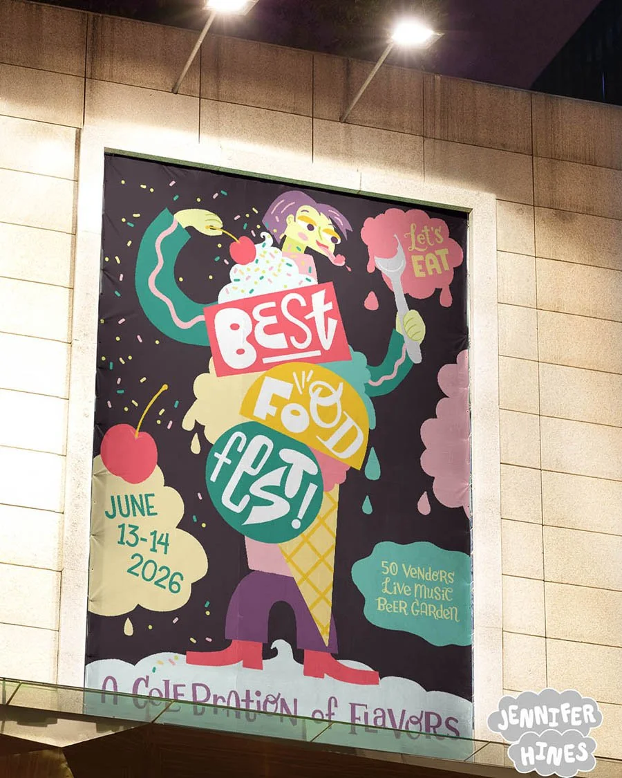
Tasty ice cream variation of the food festival logo and advertisement poster for the food fest.
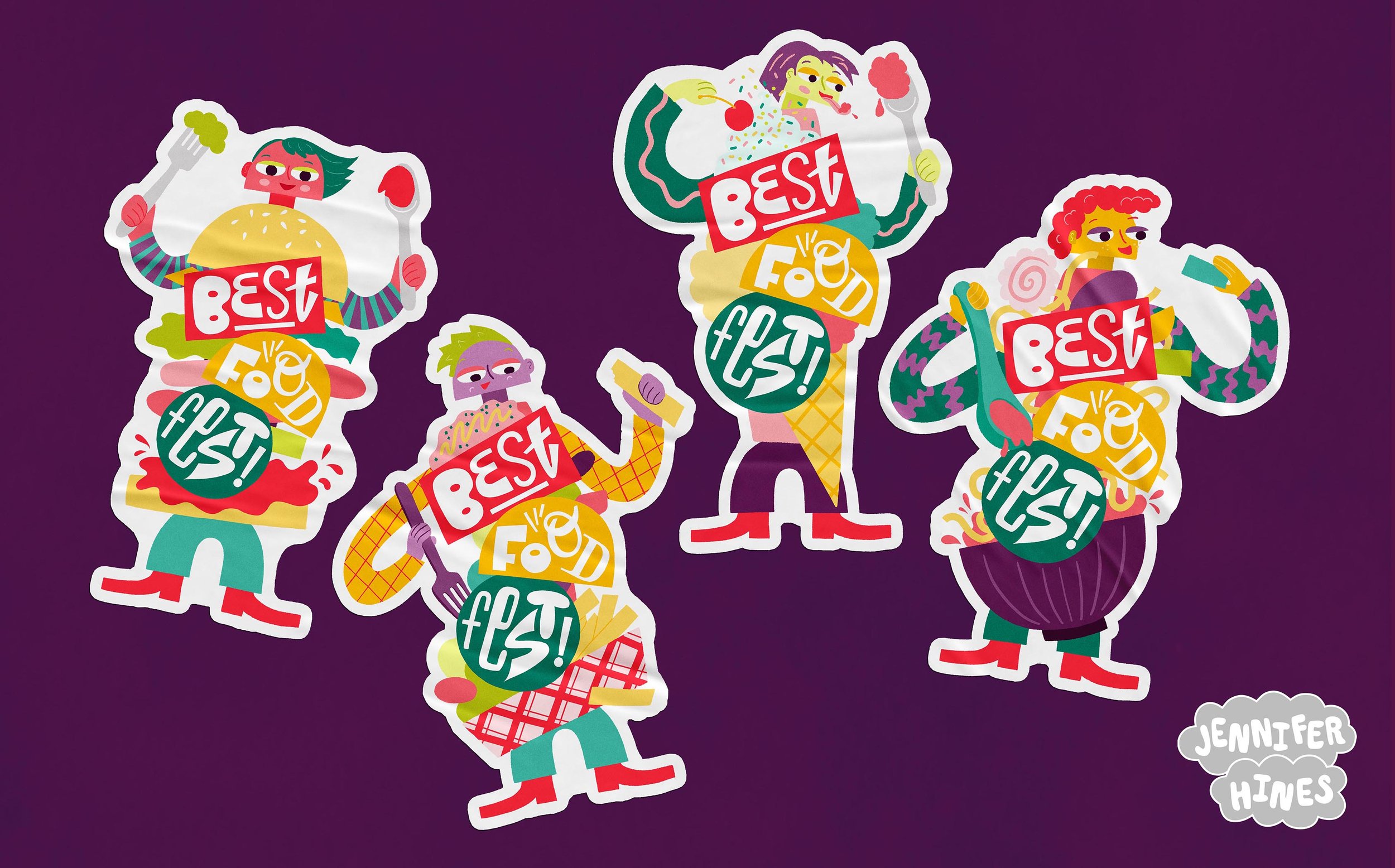
Stickers! Fun sticker sets featuring each of the four food festival character designs.
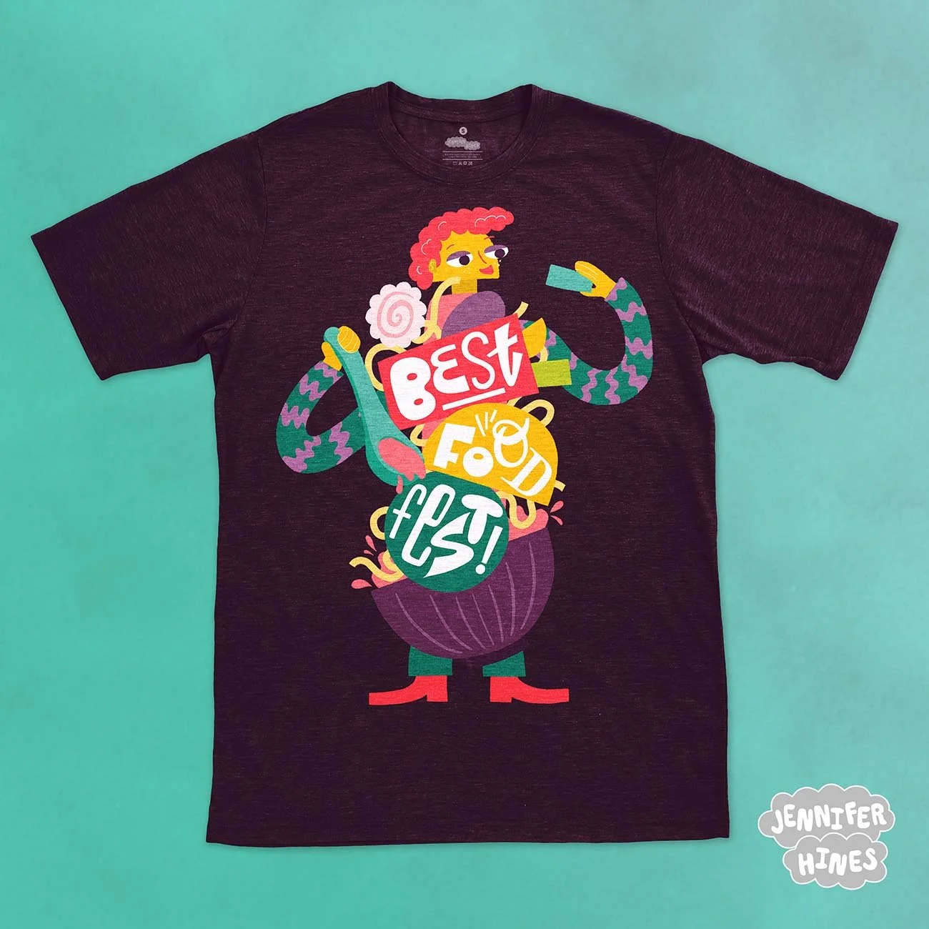
Look how amazing this t-shirt looks with the food festival character, featuring the hand-lettered food festival logo treatment as a ramen bowl character!
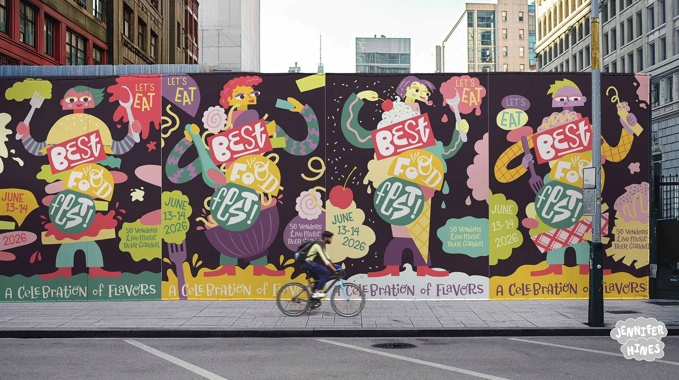
All four illustrated posters for the Best Food Fest event poster series shown on a wall—what tasty characters to brighten up the street here!
These images can also be licensed for your greeting card, product, or social media feed. Please reach out to me via my licensing page to inquire about purchase rights.