Rita Lita Hot Sauce Packaging Illustration and Design
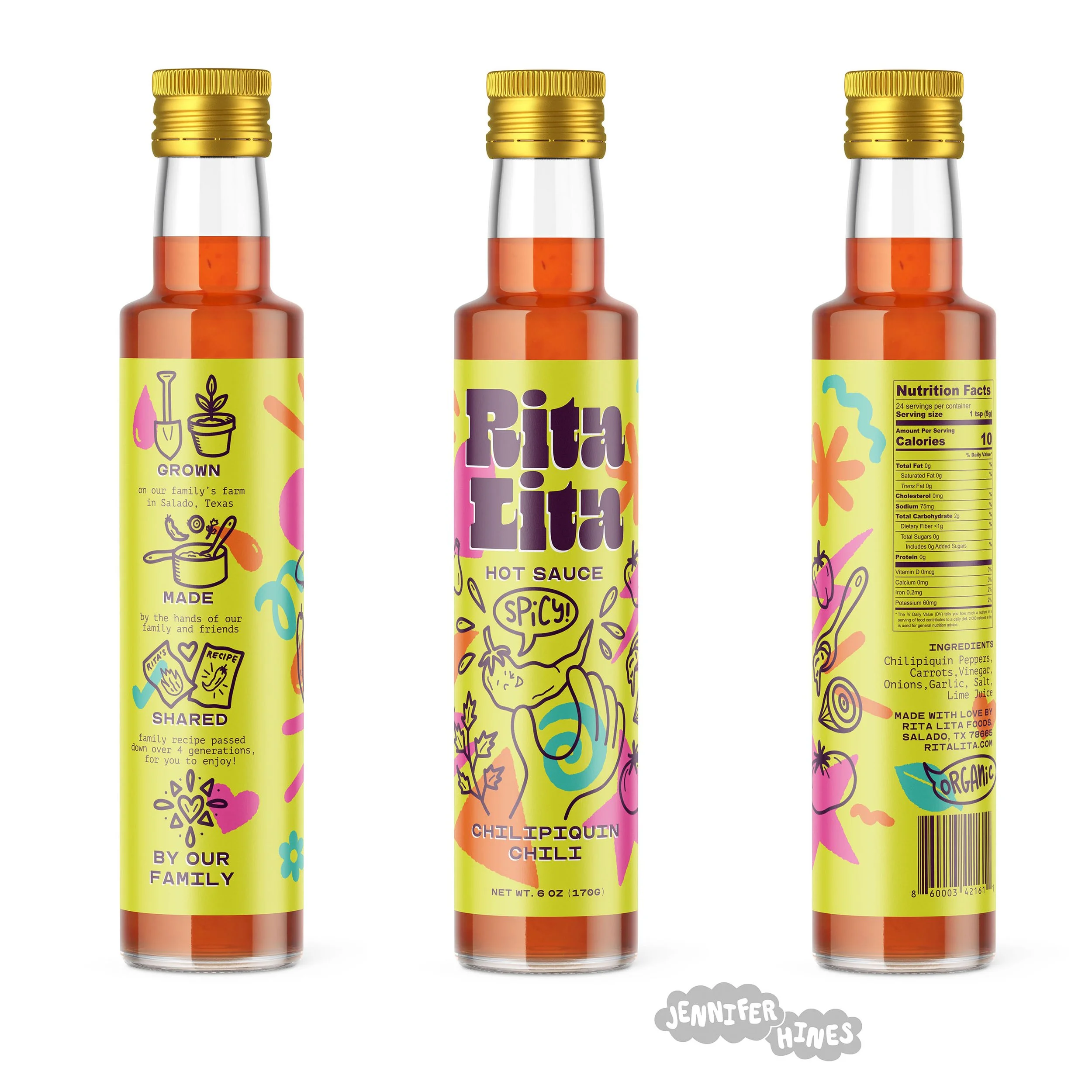
The final Rita Lita premium hot sauce bottle design featuring a fun line drawing overprinted on bright geometric shapes in the background. This hot sauce packaging illustration highlights the fun of the brand in a unique way.
The Brief: To create an illustration for a premium hot sauce brand label for a unique hot sauce packaging design
Role: Illustrator responsible for concept, design, and implementation of all lettering and illustration, including color palette. Branding, logo, and dieline provided.
Tools Used: Procreate app, iPad Pro, Photoshop, Illustrator, Apple pencil.
This hot hot hot illustration highlights playfulness of the Rita Lita brand in a fun and colorful way to stand out on the shelf while communicating the brand personality. Created as part of a brief from Wonderkind Co. and Inky Goodness for a packaging design course, this illustration shows this premium hot sauce brand in a new light. The brand logo and packaging dieline were provided, and I developed multiple sketches speaking to the Rita Lita brand history and spicy recipe, finally selecting the one that had the most unique shelf appeal and styling to speak to their target audience. The color palette I selected spoke to the spiciness of the brand but is elevated above the traditional expected palette to look fresh and hot, suitable for this premium product. The final illustration is on a bright background with fun pops of color created as hand-drawn geometric shapes behind an overprint of line drawn elements that show their ingredients and brand personality.

Initial sketches for the Rita Lita Hot Sauce packaging illustration. Lots of different directions were explored, including character illustration and more traditional patterning.

I chose two of the sketches to create more developed color sketches, and testing them on the hot sauce bottle packaging. The overprint style with the character line drawing was the most playful and spoke to the brand values and suited the client brief more closely, so that was the packaging concept that was chosen to push to the next level.

The final hot sauce packaging illustration for the label, featuring a fun chili pepper line drawing overprinted over hot pops of color illustrated in a loose style.

As part of the project, I also created the color palette for the packaging and branding, and a set of hand-drawn icons that could be used independently of the packaging.

The final hot sauce packaging illustration on the bottle label is such fun and definitely stands out on the shelf to highlight this approachable premium brand.
These images can also be licensed for your greeting card, product, or social media feed. Please reach out to me via my licensing page to inquire about purchase rights.