Luna Ice Cream Packaging Design Branding and Logo Illustration

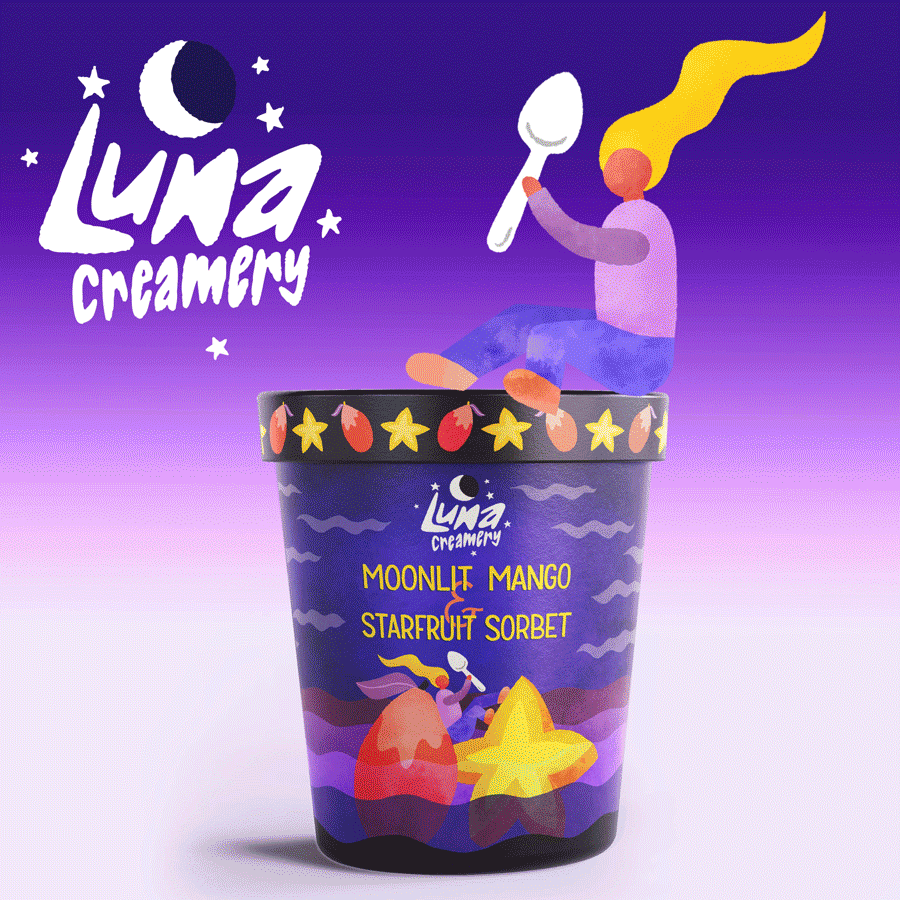
The final ice cream packaging illustration and design features a hand-drawn logo and hand-lettering for the flavor name, plus a playful illustration of a woman on floating fruit to illustrate the flavor.
The Brief: To create an illustrated package design for Luna Creamery and their four ice cream flavors.
Role: Illustrator responsible for concept, design, and implementation of all lettering and illustration.
Tools Used: Procreate app, iPad Pro, Photoshop, Apple pencil.
Ice cream packaging can be such fun and so colorful to stand out in the freezer aisle, and this ice cream tub packaging design leans into the color and evening vibes while keeping the celestial fun. As a personal project, I created a hand-drawn logo for a fictional ice cream company called Luna Creamery. From there, I created an ice cream tub packaging illustration for a key flavor, including hand-drawn lettering for the flavor name, a full lid design including the side rim featuring colors and fruit related to the flavor, and a fully-illustrated ice cream tub image for the main tub. I wanted to combine both a character and highlight the taste and fruit for this flavor.
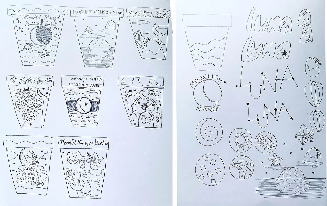
Some of the sketches and explorations created by hand for the ice cream tub packaging design, including the hand-drawn lettering, hand-drawn logo design, and hand-illustrated image for the packaging.

The final label illustration for the ice cream packaging. The hand-drawn logo sits above the lettering for the flavor title, along with a fun and colorful illustration featuring the fruit of the flavor and a small character.

The final lid design for the ice cream packaging features a large-scale version of the logo and colors that change out for the flavor. The rim edge has a repeating pattern of illustrated mangos and starfruit to suit the flavor, and the hand-drawn logo and color swatches for the brand and flavor are shown on the right.
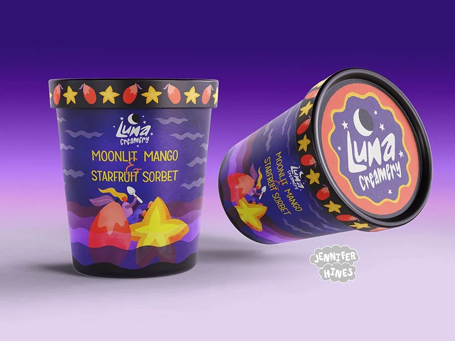
The final tubs, featuring the hand-drawn logo for the creamery, the hand-drawn lettering for the flavor names, the custom rim illustration for the ice cream packaging lid, and a fun and vibrant illustration featuring a character and the flavor components on the front.
After the mango flavor illustrated packaging was completed, the three remaining flavors were drawn to match. A hand-drawn font was created to use for the flavor titles and related ads. In addition, a fun ad and gif were created to help highlight all four flavors. This illustrated suite of four ice cream tubs, complete with hand-drawn logo and hand-lettered font, was a great exercise in food packaging design and vibrant food illustration.
A fun gif showing all four flavor designs of illustrated ice cream packaging, complete with the character illustrations and hand-drawn font and logo.
These images can also be licensed for your greeting card, product, or social media feed. Please reach out to me via my licensing page to inquire about purchase rights.