
Millie & Joy Baking Products Hand-Lettered Illustrated Logo
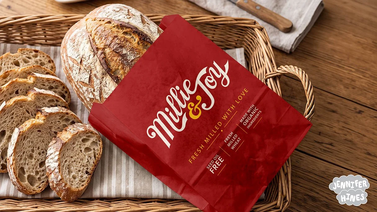
A hand-drawn logo illustration created from scratch for Millie & Joy, a baking company specializing in high-protein muffins and other baked goods using fresh milled wheat.
The Brief: To create a unique and original hand-lettered logo for a small baking product company, Millie & Joy, for them to use in their branding and packaging.
Role: Illustrator and lettering artist responsible for concept, design, and implementation of all lettering with the client-provided color palette.
Tools Used: Procreate app, iPad Pro, Apple pencil, Photoshop and Illustrator.
Millie & Joy needed a fresh and original logo to use for their baking product company that suited the homemade and fresh milled wheat products they were creating for consumers. They were seeking a hand-drawn logo that was nostalgic, warm, wholesome, and timeless to feel like a beloved family baking brand. They provided their brand colors of deep red, cream, and gold and asked me to create a fresh logo for their packaging and brand.
After the client came up with an AI concept that wasn’t quite what they wanted, they decided to hire a human to create a hand-drawn and playful lettering-based logo with a nostalgic feel with the same prompts. Disclaimer that I did NOT see the AI concept at all while working on their logo in the entire process from sketch to finish, and created a wholly original and human-made logo based on my intuition for the descriptive words and vibes the client was seeking.
To start, I went to pencil and paper to do some rough sketching of lettering styles and a few letterforms and ampersands that I thought suited the key words they client provided. I referenced books and other fonts as inspiration, and then drew up my own ideas from there. I also researched their competitors as provided to ensure my logo concepts didn’t look too similar to any competing products or companies. This always part of my process to ensure I give a truly differentiated logo design!
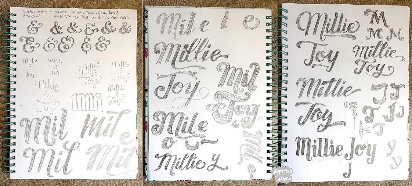
Always great to start a logo on paper! I grabbed some books and references for inspiration and then sketched out letters and ligatures I thought might work for the logo based on the client description and brief.
After the pencil sketches, I moved to my iPad and pencilled in a variety of different logo ideas. My iPad is where I can test out more ideas, using my sketches and iterating on them. Ultimately I had 7 different sketches to start, and whittled it down to five contenders for my client to look at. Luckily, they loved them and selected one that was their favorite and had the heritage-inspired vibes they were seeking.
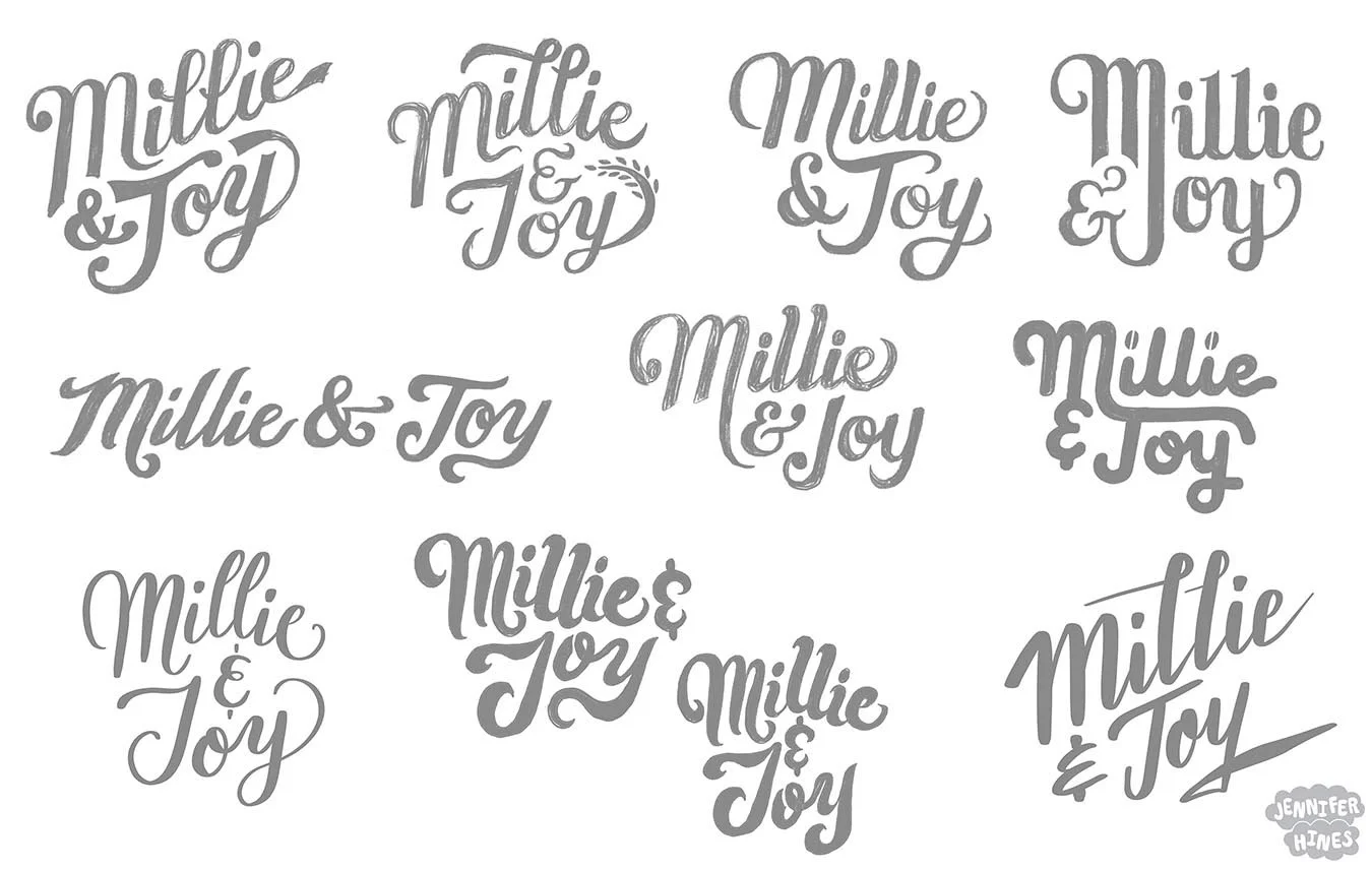
Part of figuring out a a logo design is trying lots of things! So I created sketches that tried different layouts, lettering styles, ligatures, and flourishes. Some didn’t make the cut to show the client, but it’s part of the process.
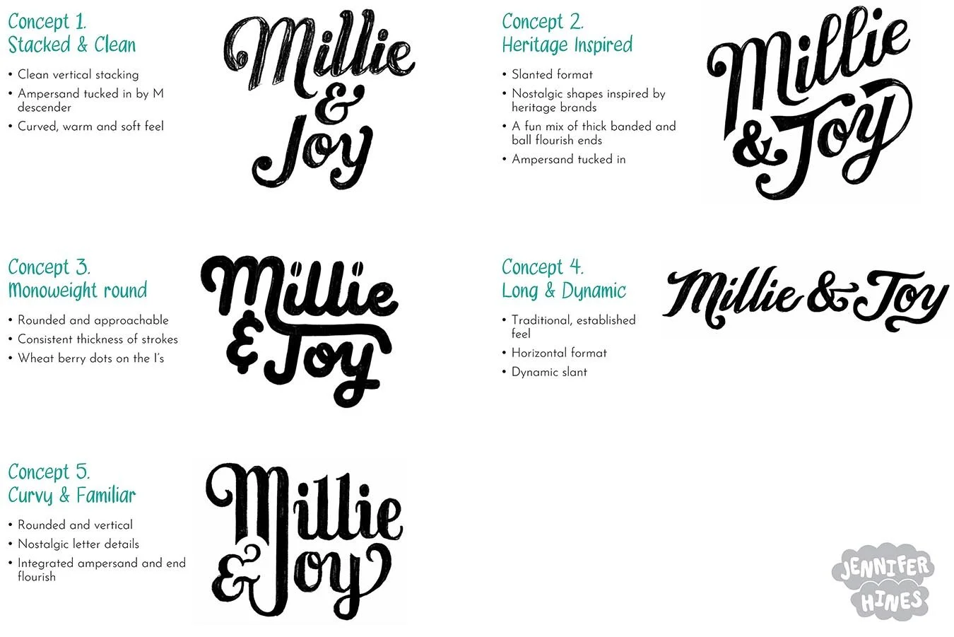
The final five lettering concepts I sent to the client for a hand-drawn lettering logo for their baking company. I whittled down all my concepts and refined 5 contenders, and gave them some descriptives to help show what I was aiming for when creating the logo concept sketch.
After the client selected the Heritage Inspired logo sketch and we moved forward, they asked if I could test out some additional ligatures for the “e” and “J”, which allowed a more horizontal layout. They also asked if the angled baseline I had in the concept could be flattened out a bit. I created updated color sketches with both ligature options and baseline shifts, along with some other minor modifications of the bowl in the J and M loop flourish. They really liked the way the "e” and “J” connected, and took these four samples and quickly plugged them into Canva into their packaging concept to see how it would sit and asked for a gentle italic for the final. I took their feedback and created a final vector version in their brand colors.
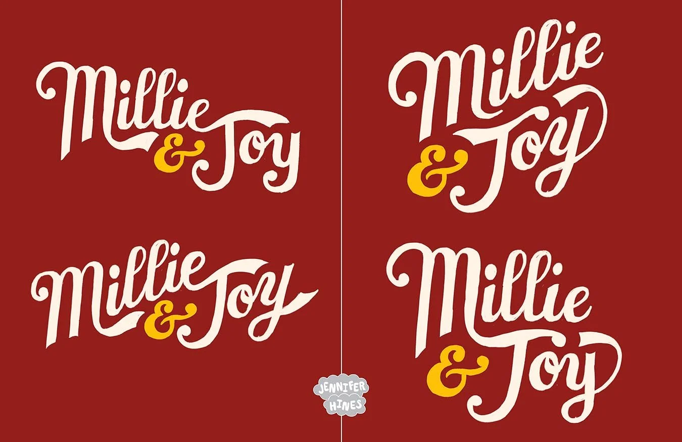
After the client selected one logo sketch they liked best, I put it into their brand colors and tested out a few different ligatures and baseline tilts. Hand-lettering is such fun to play with different scenarios of logo configurations.
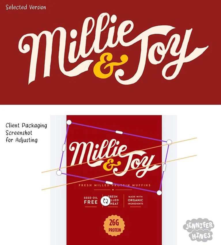
The client took their favorite sketch from my lettering logo color versions (above) and plugged it into Canva to see how it would look on their packaging. We decided to adjust the tilt of the baseline a bit as a result of how it suited the packaging best.
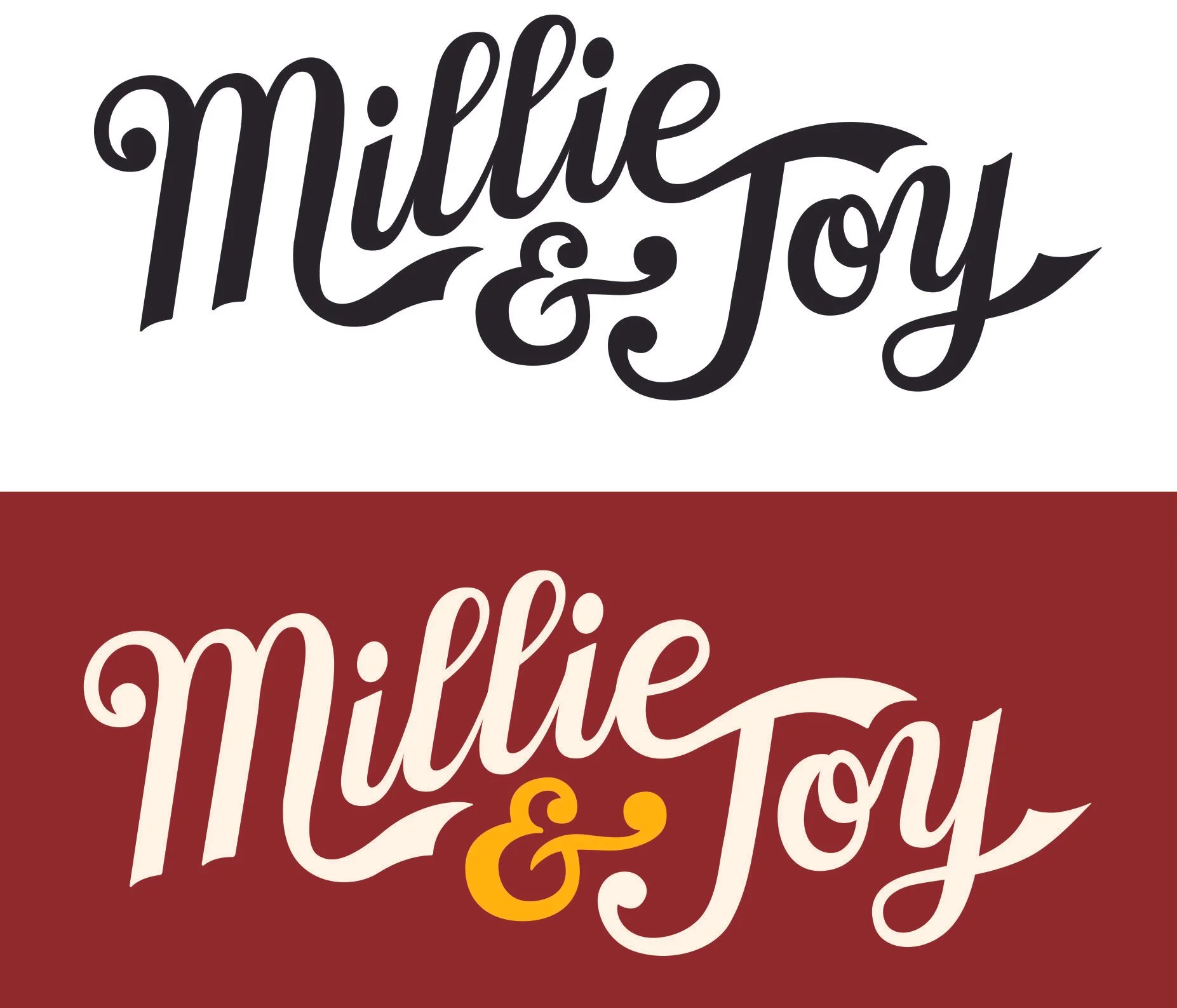
And here’s the final! I updated the final sketch in vector format and smoothed out the edges for a final, clean and inspired hand-lettered logo. The client loved it!
“Working with Jennifer was a breeze! She was kind, attentive, and thorough. Her talent for hand-drawings is really impressive!”
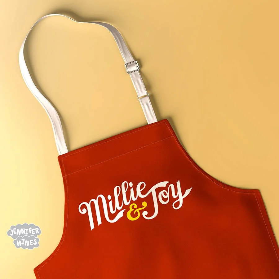
The final baking logo for Millie & Joy on an apron, and doesn’t it just pop!?
The client was extremely happy with the final and said that it surpassed their AI logo concept by significant measures. It just goes to show that human minds can still create original things that look different, fresh, and enticing better than machines.
“Looking at our [AI] inspiration now is funny because [Jennifer] created a design that went so above and beyond what mock up we started with. ”
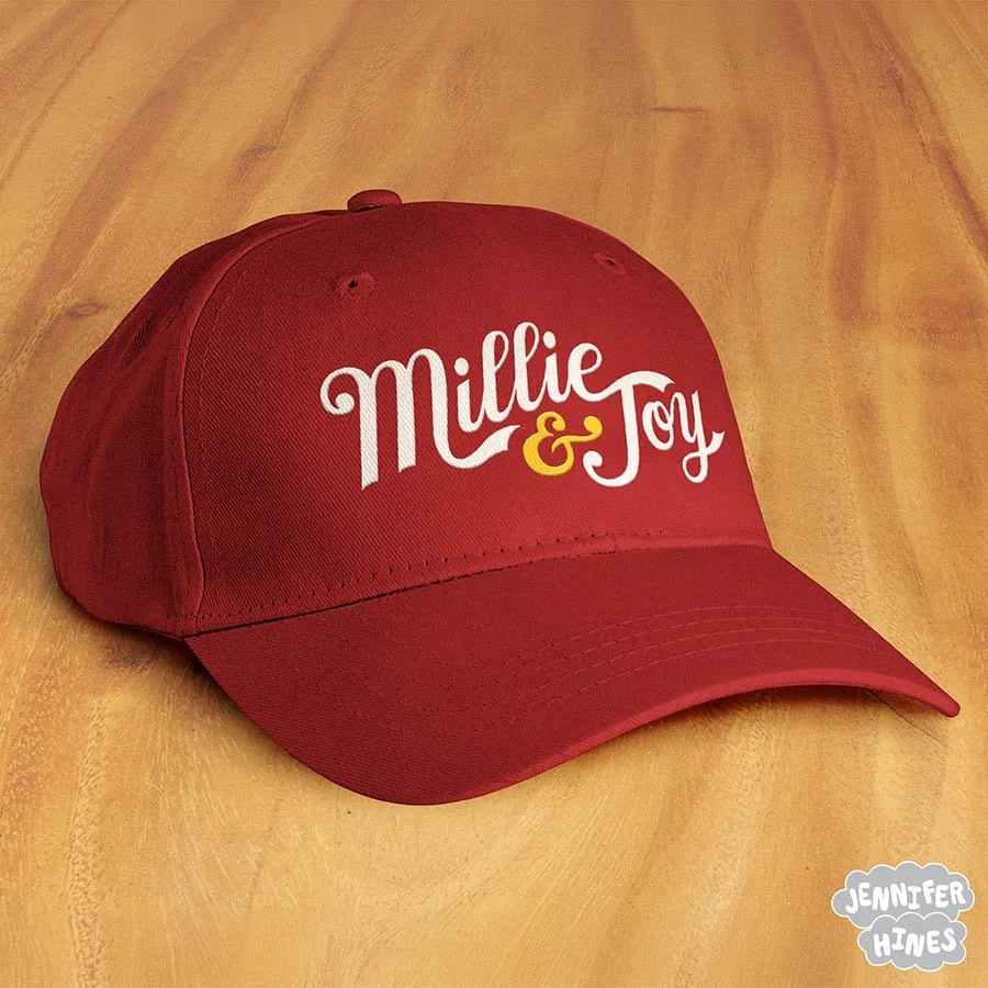
The Millie & Joy logo on a hat! I love seeing how this hand-lettered baking logo sits on branded merchandise.
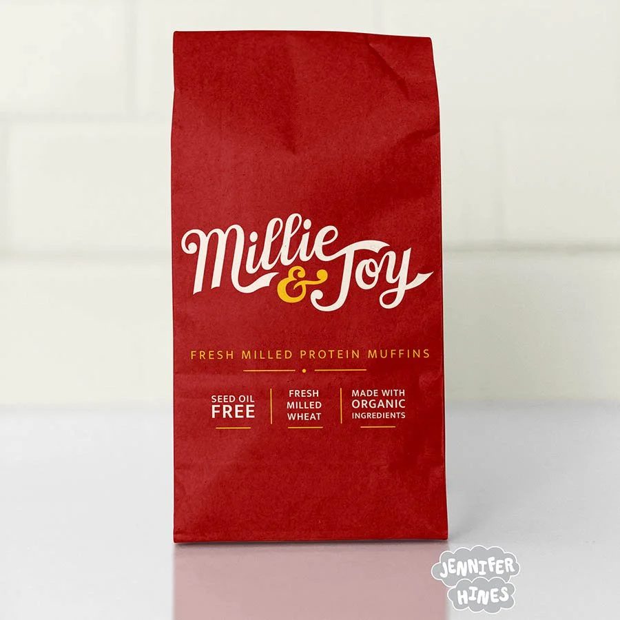
A final mock-up of some packaging for fresh milled protein muffins for the company Millie & Joy, featuring the brand new hand-drawn logo for this home-style baking company. Chef’s kiss!
After the project, Madeline had this to say of our collaboration: “Working with Jennifer was a breeze! She was kind, attentive, and thorough. Her talent for hand-drawings is really impressive and we are so grateful for her expertise in helping us get the design for our new business off the ground! … Thank you for creating something so original and fun!” -Madeline of Millie & Joy, millieandjoyfoods.com and @millieandjoyfoods (both to be live soon!).
Many images of my artwork can also be licensed for your greeting card, product, or social media feed. Please reach out to me via my licensing page to inquire about purchase rights.