
After figuring out your composition in thumbnails, it’s time to go big! Finalizing your composition, adding illustration, inking and coloring!
Welcome to part 2 on creating a multi-word hand-drawn lettering piece! (You can view part 1 on starting your piece here). So you’ve chosen your phrase, decided on the hierarchy and penciled out some thumbnails, and then fine-tuned your thumbnail(s) a bit bigger to decide on a final composition. What next? This blog will take you through the remaining steps on how to get your lettering composition from sketchy to wow!
6. Draw Guides and Skeleton Letters
Now that we have figured out our composition and tested it a bit bigger, it’s time to start at full-size! Start by penciling in some guides in to show borders and where your words will go based on your thumbnail sketch. This is also the time to make minor adjustments from the placement of things in your thumb to the placement of things on your final illustration.
Now start lightly tracing in your letters in skeleton form. Always start just with skeleton letters to be sure they will all fit before you go to the effort of adding thickness and detail. I can’t tell you how many times I’ve had to erase a beautiful letter because I ran out of room for the rest of the word! This light skeleton is easy to erase and recreate if you need to shift letters left or right or make them narrower or wider to fit. Remember that not all letters are the same width and the spacing between them will not always be the same either.
Also, when adding in your skeletons, keep in mind that if you want to create bolder or thicker letters, or add shadows around the letters, you want to have more space between those letters. Same with serifs—if you have chosen a serif font, make sure you leave a little extra space between the letters to accommodate them.
For my drawing, I already knew that I wanted illustration in the background but was still a little fuzzy on how that would fit around the letters, and how that would affect the placement and style of the “The” and “of”. For now, I just drew them in here, knowing that I could adjust once I figured out my illustration background.

My large thumbnail on the left, and beginnings of my large drawing on the right with skeleton letters drawn in.
7. Build out Your Letters and Start Adding Details
If your skeleton letters look like they are spaced properly and you’re ready to move on, next we’ll add some thickness to our letters. We are still working lightly with the pencil so it’s easier to erase and move things before getting too far.
Review the letter style you’ve chosen in previous steps and start adding thickness around your skeleton lines to your letters to match. I recommend not just making empty rectangular outlines, but actually adding a little light shading inside your shapes. It’s much easier to see your shape size and compare its thickness to other letter shapes if it’s shaded in rather than an empty outline. Just fill it in lightly so that you can erase it later.
After you’ve checked your thicks and thins and they look consistent, add some details, like serifs or shadows. If you’ve run out of room for serifs or shadows, you can decide to omit them, or now isn’t too late to erase and move letters a bit to make sure they fit.
For my drawing, I was still uncertain about the reversed stress style of the word “Thrill” in my thumbnail so decided to do a serif version instead (luckily, starting from an already sketched skeleton, you can change your mind pretty easily!). I added the serifs to my letters, and started loosely sketching in my illustration behind it.

Pencil sketch with thickness added to the letters, and a little bit of illustration penciled in.
8. Add your Illustration or Decorative Elements
Next, it’s time to fine tune your letter shapes and add your illustration or decorative elements inside or around your letters.
Let’s first finalize the pencil letters so that you know exactly where to ink in the next step. Start by darkening your letter outer edge lines, making sure your serifs (if applicable) are consistent across your word. You can also make sure your letters align along the tops/bottoms as they should and adjust as you darken your pencil lines.
If you’d like to add letter decoration inside the letter or don’t want to fill it in dark, you can darken the outer edges of the letter and then erase over it lightly to remove the shading inside the letter, then just fine-tune those edges again where they got erased. Sometimes at this stage I will also trace it using a light table or window so I can just create outlines on another sheet of paper. Never be afraid to redraw or move to another sheet of paper.
In my thumbnail drawing, I knew I wanted to some illustration around and behind the letters, but it was hard to figure out the placement, size, and shape of these while trying to draw them around the letters themselves, in between the gaps. I decided to work on the illustration elements on separate sheets of paper to see what I wanted them shaped like, and then fit them in afterwards.
I sketched the illustration elements on paper, then used some tracing paper and outlined the text loosely, and traced the illustrations where I wanted them. I tested a few placements before I found one I liked the best. Tracing paper can be a great way to overlap things easier, and since you can move them around, it’s easier to fit things together and test out alternate versions.

Illustration elements can be tested out on another sheet of paper or tracing paper and then transferred to your finished pencil sketch to make it easier to test out ideas.
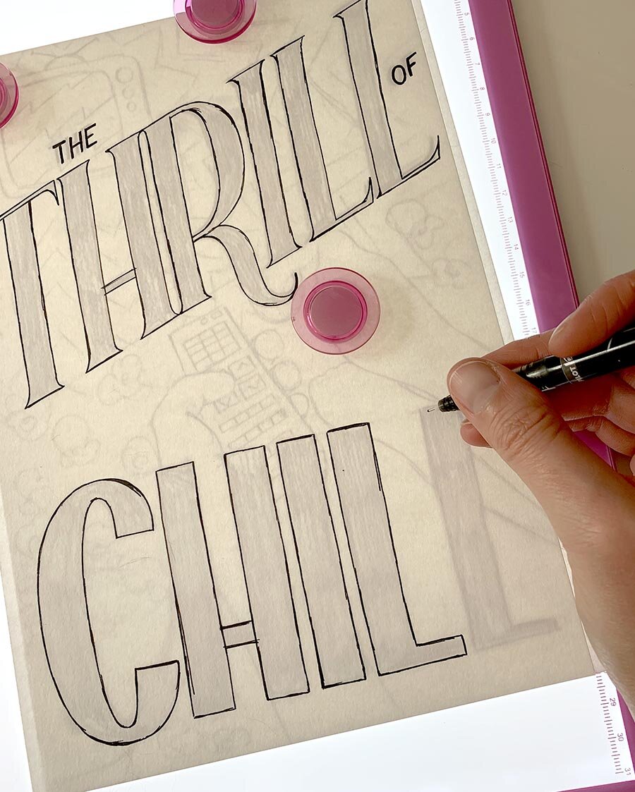
After deciding how I wanted the illustration to fit in on the tracing paper (and adding some popcorn, I couldn’t resist!), I went back to my drawing and added them in on the real paper. For this, I used a small light box I bought on Amazon to help see through the paper a bit easier, but taping your paper on a window works great too. I also went in and darkened my outlines, adjusted the size and placement of those pesky “The” and “of” words I couldn’t figure out, and made sure this was ready to move on to inking!

Final pencil sketch, with illustrations inserted, ready for inking!
9. Ink it in!
Now it’s time to ink this in! Before you move on to inking, make sure all of your letters are how you’d like them, and all decoration, shadows, and illustrative elements are included by this point.
You have two options here: ink right on top of your pencil drawing and erase it afterwards, or use a light table or window to put your pencil sketch behind a clean sheet of paper to ink on a new page. I chose the latter for my drawing, but I’ve done either option with great results!
First you should decide if you’d like your letters filled in with black or outlined and white inside or filled in with color (if you plan to color this in afterwards). If you do not want to fill in your letters with black, you need to be much more careful when inking the outline of your letters to ensure you get a nice even outline. You’ll see in my drawing that I have very uneven outlines (I focus on the outer edge of the outline so I can fine-tune it as needed), so I often choose to fill in my letters.
Ink in all the lines and illustrations. If you’re going over the pencil sketch, you’ll need to erase all the pencil when you’re done inking. Once it’s dry, go to town erasing all the pencil and leaving just the ink, and then adjust any of the ink lines on areas you might have missed.
Inking on a light table, making minor adjustments as I go. I plan to fill in my letters so am only concerned with the outer outline of the letters, not the inside of the letterforms.
10. Color it in!
I often keep my illustrations black and white, but it is nice to add color as well! I’d recommend a dry color, such as colored pencils or markers, rather than a wet color media, like watercolor. Depending on the type of your black ink pen you used, you may get some smudging and bleeding if you use color that is a wet media or with some markers.
Even if you do decide to keep your image in black and white, you can add pattern and texture, such as dots, hatches, lines, or other elements to give your piece a more finished feel. Adding decoration inside the letters or around the borders is another way to push your piece into another level like a pro.
And now it’s finished! Great work!
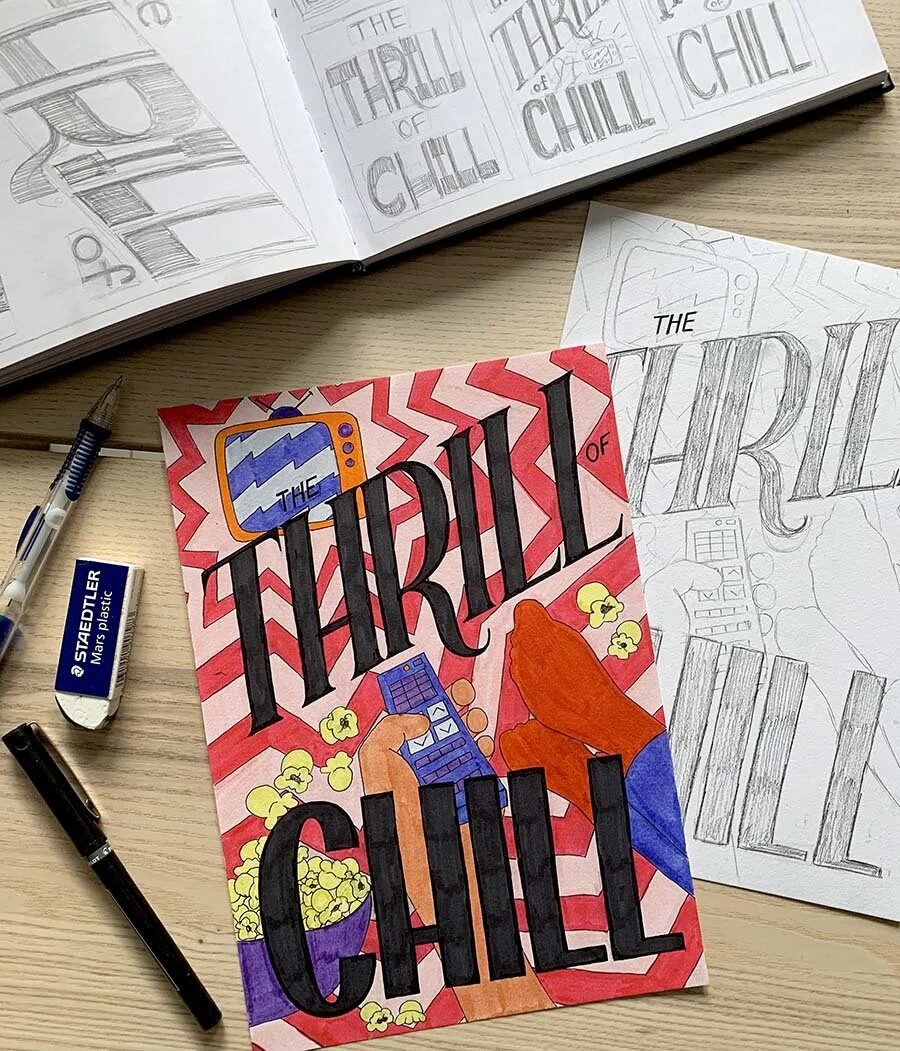
From thumbnail, to larger thumbnail, to pencil sketch, to final inked and colored piece! It’s done!
Yay! I’m done! But what about digitizing this?
Congratulations, you have a lovely hand-drawn lettering piece! Hang it up on your wall, mail it to a friend, whatever strikes your fancy.
But perhaps you’d like to sell copies of your image on a site like Society 6 or Redbubble, or in your Etsy shop? How do you go about digitizing this? Find out more in future blogs… stay tuned for more.
Additional Resources
If you've enjoyed this short tutorial, consider signing up for a longer course in learning hand-lettering, which can be found on my Workshops page on my website. You can follow me on Eventbrite to get notifications when I announce a new online or in-person workshop and grab tickets before they sell out.
If you’d prefer to learn on your own, you can also purchase a full beginning hand-lettering digital workbook to study in the comfort of your own home. This is an updated digital version of my workshop booklet and is a 16-page PDF with exercises and the steps to create a full lettering piece from start to finish. You can purchase the digital workbook here.