Creating a hand-lettering composition takes more than a few steps, but the process helps to make a final piece you can be proud of!
I’m sure you’ve scrolled through Instagram and have seen all sorts of amazing lettering artworks and thought, “How do they do that?!” Well, it obviously takes practice drawing, but there are some steps you can take when embarking on a lettering composition that can help to make sure you nail it and catch your mistakes early on. This is part 1 in a 2 part series on sketching a multi-word lettering piece. Read part 2 here.
1. Pick Your Phrase and Write it Out
You might think the first thing you should do is to start drawing, but stop yourself for a minute. Start by writing out your phrase. Yup, in just normal handwriting. This helps you see the shapes of your words. Try both lowercase and uppercase, and a mix of the two.
Uppercase words tend to form a rectangle where lowercase words may have bits of the letters that go above and below the other letters. A mix of both upper and lowercase may leave some interesting empty spaces for illustrations or flourishes. Who knew there would be so much to think about with just handwritten words!?
Once you see the shapes of your words, you can think about heirarchy and styles so you know how they’ll fit together.
2. Decide on your Hierarchy
If you have multiple words in your phrase, should all be treated the same? What words do you want people to notice first? What words are less important and can be a bit smaller and more in the background? Decide on your hierarchy—underline the most important words twice, any secondary words once, and put no underline under those little connector words that are less significant, like “the” or “and”.
Those most important words will be the ones that you want to draw the biggest and with the most detail. Ideally you’ll pick 1 or 2 main words that are the most important in your phrase. The rest of the words can be treated smaller or with less styling.

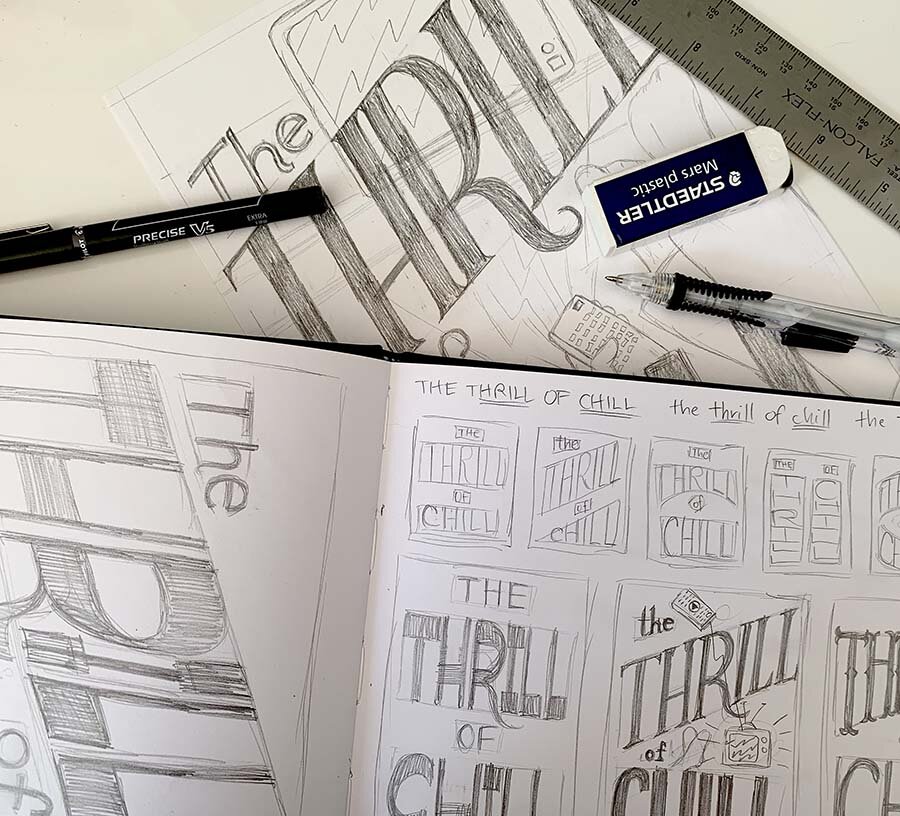
I knew that “THRILL” and “CHILL” would be my important words in my phrase so decided to make them uppercase, with “the” and “of” remaining smaller and lowercase. Then I tried out some different compositions using shapes for my words—two big boxes for THRILL and CHILL and two smaller shapes for the remaining words.
3. Think about Style
After you know your words and what you want to stand out the most, you start to think about what you’d like your piece to really SAY. What sort of mood are you trying to convey? Do you want something big and bold, or delicate and feminine, or something else entirely? Uppercase can often be more punchy and bold or graphic, where lowercase can be a bit more subtle and approachable. Uppercase is also good for shorter words but a bit harder for longer words because it takes up more room.
Knowing the style and mood you’re aiming for also will help you pick the type of letterforms you want to draw. If you’re aiming for a softer, quiet mood, then you’d want to pick a delicate typeface and weight instead of a big thick letter that will be a bit more in-your-face. What type of letter styles help to convey your mood? Keep these in mind as you move to the next step: thumbnails.
4. Create Some Thumbnails
Once you know the case, hierarchy, and style of your phrase, it’s time to create some possible ideas for composition. How will these words fit together? Thumbnails are a great way to test out some ideas before devoting too much time to one that might not be successful.
Remember back in step 1 where you figured out the shapes of your words? Now that comes in handy. What also comes in handy is that hierarchy and how important (or big) some of your words will be.
When creating thumbs, it’s so much faster to create compositions using SHAPES for your words—usually that’s a rectangle or shape that your text will fit into. You can block out multiple compositions super quickly to see how they might fit together. So don’t start by adding in any letters at all—start only by adding in shapes that will stand for each word in your phrase.
Thumbnails should only be 1-2 inches or so in size so you can work quickly. You can start by drawing a square or rectangle about 1-2 inches in size to represent your page, then add in the shapes for each of your words in different configurations to test out how they might sit together. Words can be all straight and stacked, can be arched or curved, and be set into other shapes… you get the idea.
After adding in shapes for each words, you can lightly add in letters to see how they will fit and if your shapes are the right size. You can also find out any issues you might have with that composition (like a huge empty spot or a really long word that has to be smaller).
I recommend making at least 3 different thumbnails so that you test out multiple ideas instead of just going with your first one. There have been times I’ve come up with a much better layout by forcing myself to create more thumbnails, so it can really pay off.

Testing out a few of my smaller thumbnails in larger size, again starting with shapes to see how the words may fit together.
5. Recreate Some Bigger Thumbnails
Now take a look at your thumbnails. Which ones do you like the best? Pick 1-3 of your thumbnails to redraw just a tad bigger (like 3-5 inches). This will help you flesh it out while still staying small. Again this is all about making your choices and testing things out small so you’re not wasting time on a composition that in the end doesn’t quite work.
You can start again by drawing a rectangle in the shape of your paper, then adding some center lines or lines around the edge to form a border edge. Again, start with just shapes to get it down quickly. Then lightly trace in letters. Think about the styles you picked in step 3 as you pencil them in. If you’d like bigger, bolder letters, make sure your rectangle for that word is bigger and leave more space between the letters to accommodate adding that heavy weight.
At this slightly larger size, you can start adding some weight to your letters to make sure it’ll fit and look nice with the layout. Don’t spend too much time here, this is still just a thumbnail. But adding some of the letter styles and weight will help you understand how much space you might need when it gets bigger, and think about how the entire thing will come together.
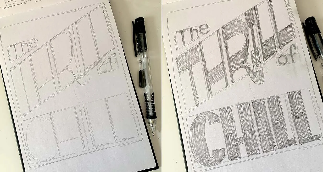
Creating a bigger thumbnail: first with skeleton letters, and second built out with a little weight to get a better idea. These are about 5”x7” in size, so still smaller than what I want my final piece to be. I’m still not sure about the placement of the “the” and “of”, or the styles of text together. I’ll resolve these in the next blog.
Now, what next?
You should now have at least one larger thumbnail of a composition that will be the direction you’ll continue heading in as you redraw your composition bigger. The best part is that if you don’t like any of your thumbnails, you can start over without having spent too much time yet.
This is the end of part 1 of this blog, so jump on over to Part 2 - Finishing a Hand-Lettering Piece, which will discuss how to push your drawing farther and redrawing it in full-size, and catching some mistakes as you go along to perfecting it!

Testing out a few different styles at larger thumbnail size, as well as thinking about illustrations or ways to fill empty spaces in my layout.
Additional Resources
If you've enjoyed this short tutorial, consider signing up for a longer course in learning hand-lettering, which can be found on my Workshops page on my website. You can follow me on Eventbrite to get notifications when I announce a new online or in-person workshop and grab tickets before they sell out.
If you’d prefer to learn on your own, you can also purchase a full beginning hand-lettering digital workbook to study in the comfort of your own home. This is an updated digital version of my workshop booklet and is a 16-page PDF with exercises and the steps to create a full lettering piece from start to finish. You can purchase the digital workbook here.