After 2 parts of this blog getting prepped for the lowercase alphabet, we’re finally ready to dive into letters! For this blog, you should be familiar with forming the basic strokes as shown in Part 1 of this blog series, as well as the more advanced strokes in Part 2 of this blog series. All of the strokes you’ve learned up to this point combine together to form letters. So let’s get started!
Don’t Forget the Basics
Before you go further, don’t forget the basics of brush lettering:
Hold your brush pen at roughly a 45 degree angle, so a bit on the side of the full felt tip so you can use more than just the point.
Remember that Up is thin and Down is thick.
The Lowercase Alphabet
All letters are made up of single or multiple strokes, so all of the basic strokes we covered in Part 1 and Part 2 of this blog series are just the building blocks to make letters. Some of the strokes you’ve learned will curve into the next stroke, or may need to be changed just a bit from when you were drawing it all by its lonesome to when we start combining it with other strokes to form a letter, but the basic building blocks are still the same.
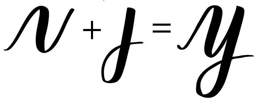
A lowercase letter “y” is made from combining the squiggle and a vertical with under loop stroke. Wow!
Here is a reference for the lowercase alphabet that you can use as reference. Look at each letter and see how you can break it down into the strokes you’ve already learned.
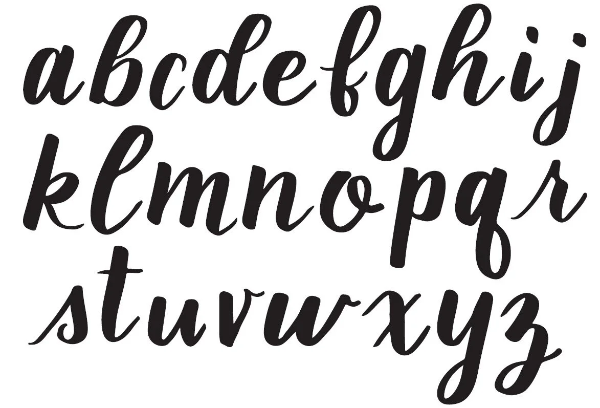
A lowercase alphabet for you to reference and learn brush lettering for the lower case letters.
There are actually lots of variations of letter forms, but the reference here will give you a good feel for the main lowercase letterforms and how they are formed. Letters like the “r” and the “s” can have a loop at the top where the upstroke meets the downstroke, or not like shown here. Letters like the “b” can have the loop end at the stem as mine does, or it can loop back to the right to reach the next letter.
I recommend that you cruise Google, Pinterest, and books at your leisure to look at more alphabet references to find the letterforms you like best. This will also help you think about style, flourishes, and fun loops or curves that extend off of the letterforms, which I’ll talk about more in a later part of this blog series.
Forming Letters
Each letter is made up of multiple strokes, both downstrokes and upstrokes that may flow into each other. Each stroke will overlap a little so that the letter looks cohesive, like the round part of the “a” will overlap the vertical part to form a natural-looking letter.

The lowercase “a” is formed by combining two basic strokes to form a letter.
Some very complex looking letters, like the lowercase “f” for example, are made up of ONE STROKE ONLY, meaning the pen does not lift from the paper and the letter is formed without pause. This can take a bit of practice, but your letter will look smoother if you don’t pause when creating it.
The strokes are generally done in order from left to right in the letter, and remember that thicker strokes are downstrokes and thinner are upstrokes. The stroke order does matter when you’re forming the letter as well. For detailed maps of the entire alphabet, you can purchase my Brush Letter Like a Pro workbook that has every letter broken down in order of the strokes and stroke direction to help you form them easier. A perfect resource for the beginner!

The lowercase “a” is formed by starting with a round “o” stroke, and then creating a downstroke that tips up at the end.
Combining Letters Into Words - Exit and Entry Strokes
Now that you’ve formed letters, you’re probably wondering how you connect them to form words. Each letter has an entry stroke and an exit stroke that will connect the letters together. Note that the exit stroke of one letter is connected to and becomes the entry stroke for the next letter.

All letters in a word will have an entry stroke and an exit stroke to connect them together. The exit stroke for one letter is the entry stroke for the next.
Some letters have the entry or exit stroke as part of the main letter, such as the “r” and the “s”, that naturally lead into the letter from the previous one. Others, like the “a”, “l”, and “w” all have an exit stroke as the end of the right-most stroke that will lead into the next letter. Others, like the “t” or “j” will need a stroke added to connect it to the letters around it. When finishing a letter, always keep going to finish the entry stroke for the next letter, which is generally higher than the baseline and nearly to the x-height of the letters. If you stop at the baseline toward the bottom, your letters won’t connect well and you’ll have a break in your line.
If your letter is the last of the word, you can stop the exit stroke a little earlier, or curve it up into a swoosh or underline for a bit of style. Try it out!
Part 4 - The Uppercase Alphabet
Smoother letterforms come with practice, so keep repeating these letters until you know them inside and out and can form them without referencing the image and they will look more smooth and natural. Next up will be the uppercase alphabet, so stay tuned!
Additional Resources
If you've enjoyed this short tutorial, consider signing up for one of my workshops on hand-lettering and illustration, including new brush lettering classes, which can be found on my Workshops page on my website. You can follow me on Eventbrite to get notifications when I announce a new online or in-person workshop and grab tickets before they sell out.